| Sign Up For Our Newsletter |
| Sign Up For Our Newsletter |

Modifying Excel Charts - Part 3
Note: these instructions are written for a Windows based computer

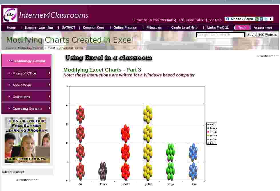
I decided to make pictures of clusters of M & M's to change the look of the pictograph. I was not satisfied with the look of the finished product, the candy pieces looked distorted.The solution to that problem was to change the width of the gap between columns, allowing the pictures to spread out.
Right-click any column of the chart and select Format Data Series . When the dialog box opens, select the Options tab. Default setting for the gap width is 150. Use the up and down arrows to reduce the gap width. The thumbnail image in the Format Data Series dialog box will change as you change the width. You may need to repeat this process until the pictures look right to you

The pictograph below was made using the steps outlined above.

One final modification you may wish to make to your chart is to change the Chart type. By right-clicking the chart area (the white area around the chart) I found Chart Type immediately below Format Chart Area . I selected Pie and then inserted pictures into each pie piece using procedures outlined earlier in this set of pages. After inserting pictures I selected Chart Options and went to the Data Labels tab to ask Excel to display the percentage of each piece of the pie. I could have also selected to had the Category Name displayed, but with pictures of the candy pieces in the chart, I decided that was not necessary.

Take a close look at the thumbnail Pie chart above. I did not like the box around the chart and I thought the gray background detracted from the look of the chart. That part of the chart that I wanted to change is called the Plot Area, so that's where I right-clicked.

Select None for Border , and White for the color of the area to create a chart like the one below.

Create a chart of your own and make modifications like those you read about in this series of pages. Send email if you make other modifications that you are proud of.

Internet4classrooms is a collaborative effort by
Susan Brooks and Bill Byles.

advertisement
advertisement
Use of this Web site constitutes acceptance of our Terms of Service and Privacy Policy.