| Sign Up For Our Newsletter |
| Sign Up For Our Newsletter |
Note: This module assumes that you already know how to create a chart in Excel. If that assumption is incorrect, you may go to a module on the topic using Excel to display the results of a survey , or a module explaining how to prepare a graph/chart from selected data on a spreadsheet .
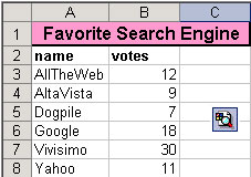
Two things are necessary before you make a graph using pictures in place of bars or columns. First, you must have data which will be used to produce a chart or graph in the Chart Wizard. Second, you must insert the image you wish to use in place of the bars or columns, somewhere on the excel worksheet. The one used below is the Windows search button from an Excel toolbar.
Use the Chart Wizard to produce your graph.
Select a single bar, or column, on the chart. This requires two clicks. The first click selects all bars, the second click will select a single bar or column. (I just tried this by clicking once to select all columns then pasting, All columns were filled with the picture. When I completed the Fill Effects steps [below] all columns were properly formatted.)
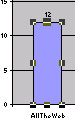
Go back to the worksheet which contains the image you wish to use. Click on the image to select it, then copy the image. Once the image has been stored in your clipboard (that's what happens when you cut or copy) return to the chart and paste the image in place of the selected bar or column.
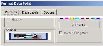
You will see a stretched out mess. Don't worry. Double-click the image to bring up the Format Data Point window. In the image below I cut out part of the window to keep images on this page as small as possible. Select Fill Effects .
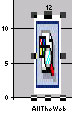
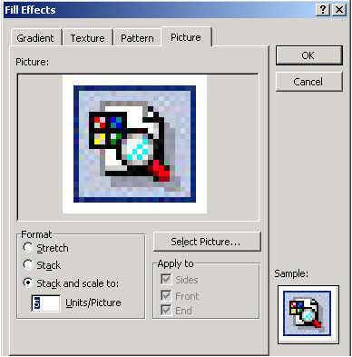
On the Picture tab of the Fill Effects window, select the radio button beside Stack and scale to: . Excel will suggest a number of units that each picture will represent. You may change this if you wish. I suggest that you go with the recommended value first, then change if you are not happy with the result.
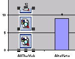
Select OK twice to get out of this window back to your chart. You will notice that only one bar or column has been changed.
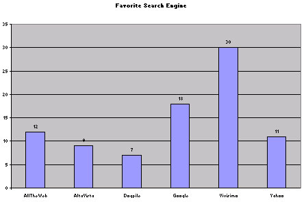
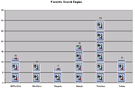
Copy that bar or column, then click on each of the other bars and paste the image. That gives you the final chart, such as the one you see below.
Connie Campbell, a well known technology trainer in East Tennessee
found a site explaining how to do this and shared it with the Tennessee trainers
list serve.
See
that document (in .pdf format)
.


Internet4classrooms is a collaborative effort by
Susan Brooks and Bill Byles.

advertisement
advertisement
Use of this Web site constitutes acceptance of our Terms of Service and Privacy Policy.